Wiener Stadthalle - Connecting since 1958
Stadthalle relaunch - event location with history
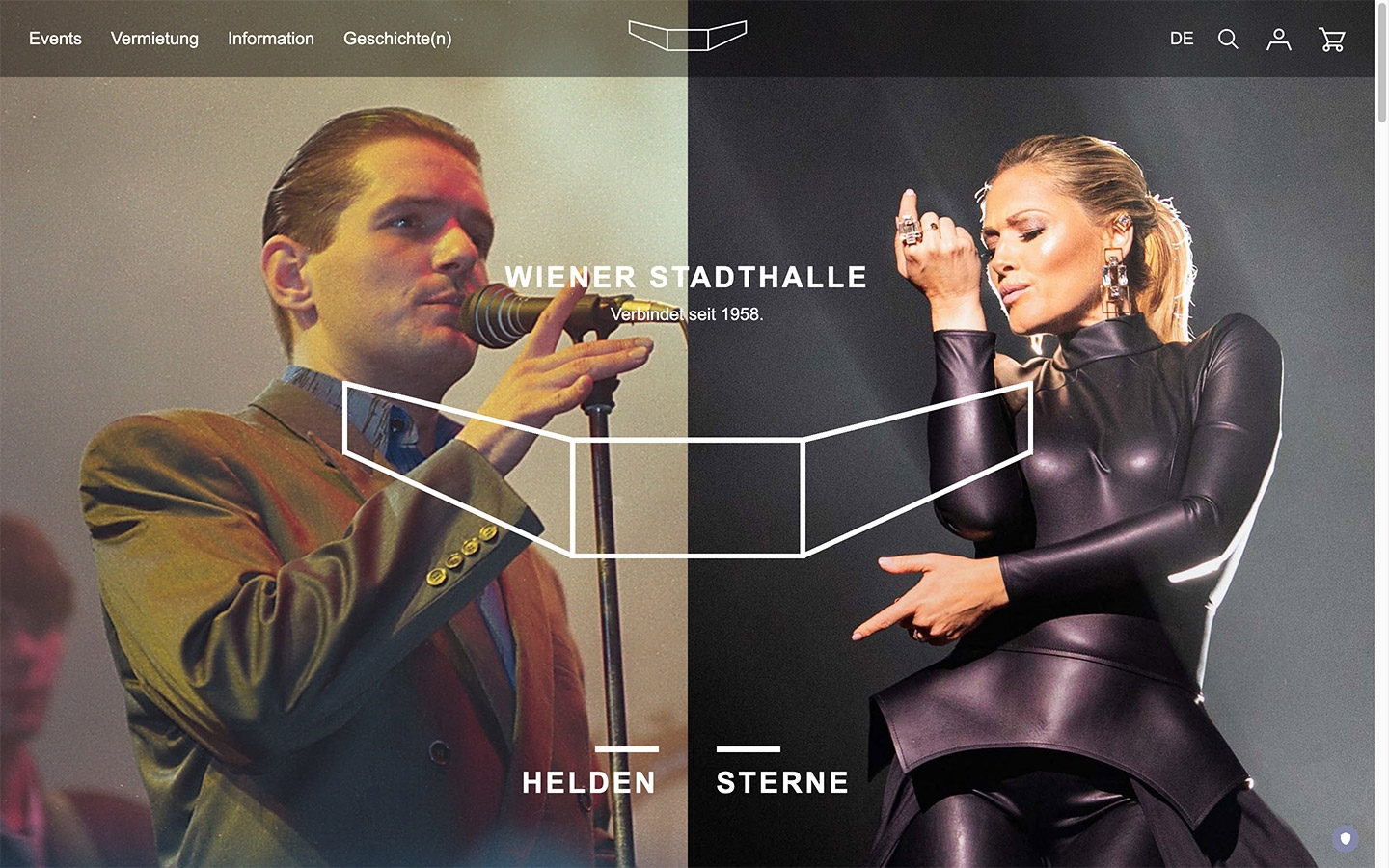
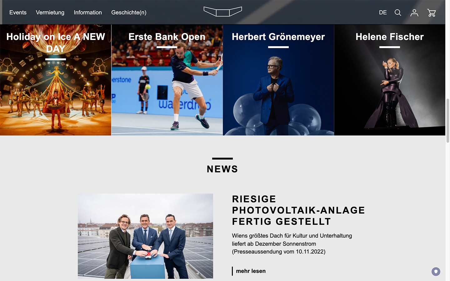
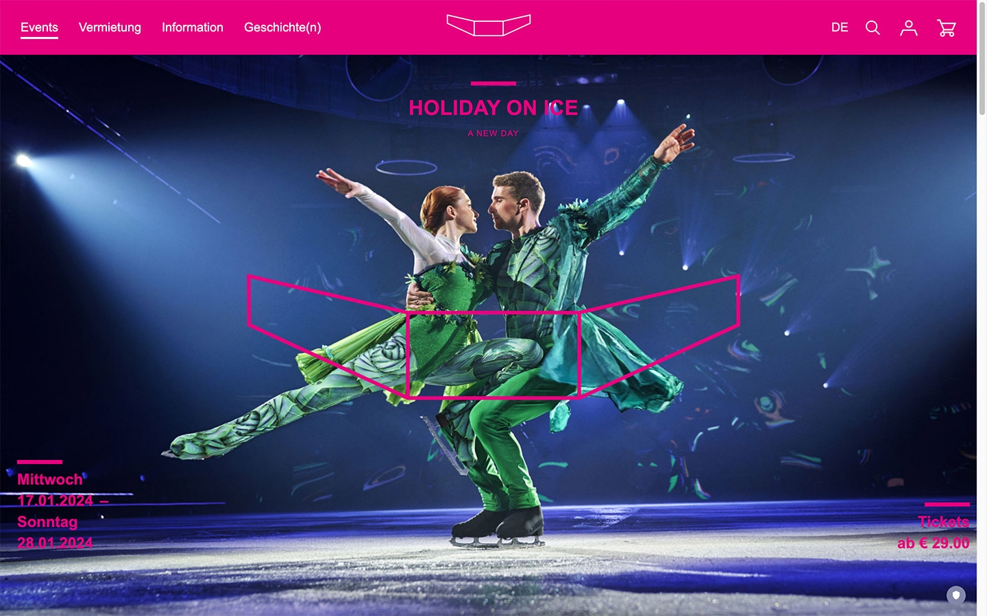
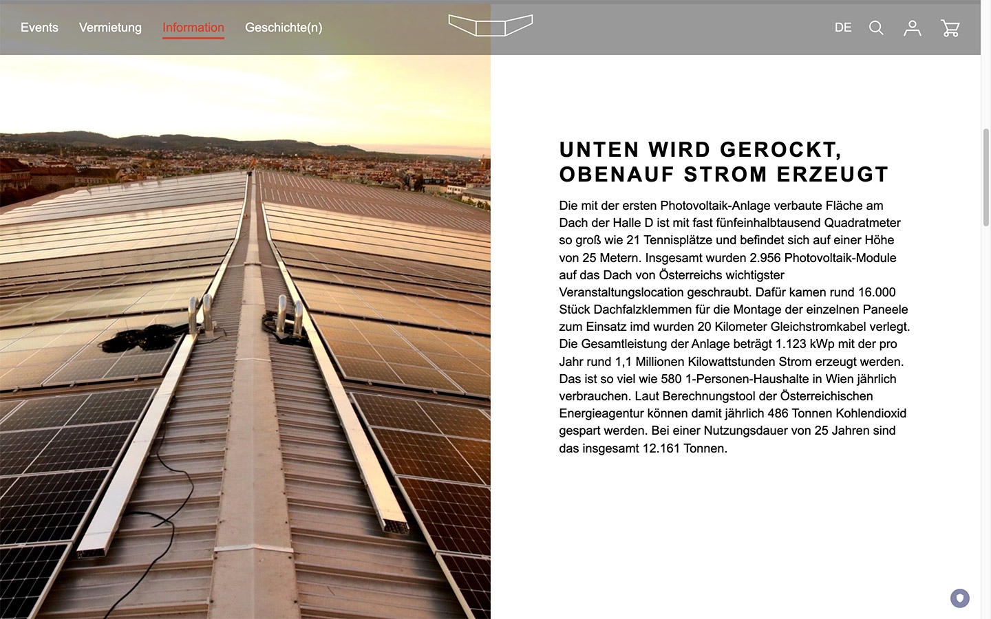
No longer focusing on the ticket store only, but with the inspiration of the traditional event location - the largest in Austria - Wiener Stadthalle has created a completely new digital presence in addition to a new corporate design. Inspiring and tradition-conscious - the Wiener Stadthalle, which has been connecting people since 1958, has also implemented this idea of connection in the digital world. The digital agency echonet managed the web design, the front-end and back-end implementation and, of course, the corresponding connections to the CRM, business system and ticketing system with the help of SAP interfaces. The Wiener Stadthalle was built in 1958 by architect Roland Rainer and digitally in 2023 by echonet on the basis of content.life 4.

04
2023
Wiener Stadthalle
Partner: WT Wien Ticket GmbH
- Project Scope:
- Sector:
- Tools & Products:
- Internationalisation:
Connecting since 1958...
Wiener Stadthalle has been managed by echonet since 2015 as part of a relaunch. This was followed in 2020 by a revision of the web design based on the same technical foundation. Now the largest event location in Austria has embarked on a new journey. In addition to the use of contentlife 4, Wiener Stadthalle has also carried out numerous other modernizations in the digital space. For the new web design, we worked intensively with Zündel Branding to achieve the best possible results for the Stadthalle's message "Connecting since 1958".
Based on the design idea, a homepage and subpages were created that allow this unifying element to be experienced visually. The revised Wiener Stadthalle logo was brought into play much more centrally and prominently, although the opposite also happened: In contrast to the previous Wiener Stadthalle websites, which echonet has accompanied since 2015, the name "Wiener Stadthalle" has now been removed from the logo in the visible area for the first time. The Stadthalle's trademark, the wing symbol, which is also the building's architectural symbol, is the point.
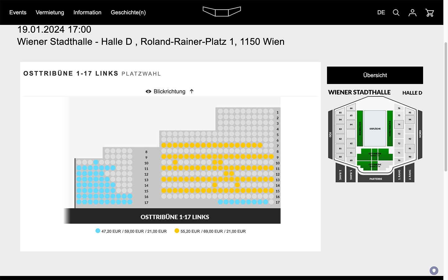
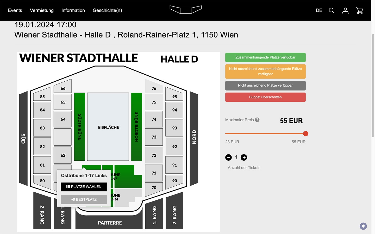
Ticket and online store with SAP technology
The echonet system, the content management system content.life, is connected to the SAP store system "SAP EventTicket" for the ticketing portal.
Interfaces, APIs based on XML-RPC
Numerous interface systems communicate with the system via SOAP and XML-RPC to retrieve information from the system, but also to transfer information to the SAP ticketing system, which is used in the background. The store solution is seamlessly integrated into the ticketing portal set up by echonet and interacts with the echonet system in terms of user registration and session handling as well as the connection, availability and pricing of the events and products that can be purchased in the ticket store.
Multilingual Structure
An important prerequisite for the use of multilingualism on websites is the labeling of content areas in the respective languages. This not only helps to achieve greater accessibility, but is also relevant for search engines. The content is recorded independently of each other in this concept. This means that the website operator decides which areas and texts to create in other languages. The language identifier is always communicated. A-synchronous translation makes it more difficult for users to switch languages directly, as there is no longer any connection between the pages.
Template parts in languages
Some fixed texts are an important component in many template systems. In addition to the texts in the footer or orientation aids on the website, many texts are standardized and stored in the template for practical website operation. These components are read into a database via a special interface technology using the "GETTEXT" process and can then be hardcoded and translated in the content management system. This means that terms such as "read more..." or "next page" are recorded centrally when browsing. These are then fed back into the template system via the interface and stored in the system in a newly generated form.

Responsive: Optimized for every Device!
Starting at the classic desktop computer, via laptops, tablets and mobile phones including also smart-TV or boardcomputers in cars, we create the website for all these devices. But there is no need anymore to place these "versions" on different URLs. The responsive web design is optimized on one page for all of the devices. That is it when we create responsive web design here with digital handcraft in Vienna.
Therefore we define in the design process with our customer together the breakpoints. These are the points, where the layout changes. For example, the text is expanded from 1 to 2 columns, so easier to read. Also, pictures appearing one by one below in mobile phones, the same pictures appear side by side on desktop computers.
CMS: contentlife 4 »Deep Space«
Version 4 of the content management system contentlife, which echonet has been developing since 1999, was used for this project. contentlife 4 - codenamed "Deep Space" - was developed on the basis of the TWIG (Symphony) template system and was released for the first time in February 2022. The back-end offers a clear content structure, the start page is already a complete dashboard with a complete content list that can be searched directly from there at lightning speed. For different projects, different relevant overview data such as current orders in the online store or marketing data such as newsletter subscriptions or community memberships are displayed immediately in the CMS. The system is equipped with drag & drop technology for file handling with download files and images. The CMS offers a range of new features in the area of search engine optimization compared to content.life 3, the previous version.
Accessibility thinking one step ahead...
While a fundamentally accessible site primarily takes into account technical and content standards, easy2see is designed as a function set for greater accessibility. The three most important core areas of the easy2see function set are:
- Web-controlled color contrasts
- Web-controlled size adjustment
- Navigation jumps via shortcut
The development and why easy2see is necessary for an optimal user experience can be read on the knowledge page Barrier-free and easy2see. This is because conventional technologies do not achieve the level of accessibility that is achieved with easy2see. The main problem is that operating systems or hardware solutions cannot distinguish between photos and text, and especially not between photos and graphics. This difference has been worked out with easy2see and is therefore a further development in terms of accessibility for websites.
